Make data analysis easier.
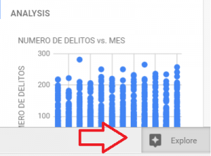
In the last update to Google Sheets, new incredible features were added: machine learning and artificial intelligence. You can see these tools working through the “Explore” bar (bottom-right, shortcut: Alt+Shift+X) .
These changes aim to make information analysis easier and faster. Inside this bar, you can see suggestions for charts, formulas and pivot tables, and you can also ask questions about your data. If you want to try this features, you can use this database for the BigMac index:
https://docs.google.com/spreadsheets/d/1jJJ7GJXWo0KCyTEkJgnz7rgdRynA4N9jRru0miHzGCA/edit?usp=sharing
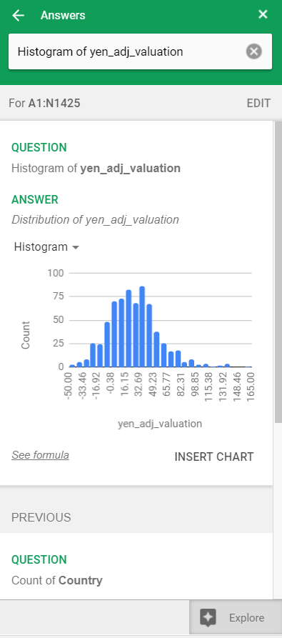
In the picture below there’s a suggestion for a chart and below this chart a link to see the formula to get this information. At the top, there’s a text box where you can ask Google about your data: count of items, average, max and min values, etc. When you open the bar for the first time, Google also suggests some questions to get details from your data.
In addition to the changes already described, the pivot table module was also improved. Just go to Data/Pivot table and start exploring. There’s also a pivot table in the same file (https://docs.google.com/spreadsheets/d/1jJJ7GJXWo0KCyTEkJgnz7rgdRynA4N9jRru0miHzGCA/edit?usp=sharing). Enjoy!


